Did you know that about 68 percent of your potential customers leave your checkout page of your online shop before making a purchase? Find out what you can do to improve your payment page – and your conversion rate at the same time.
A customer has reached your checkout page and the hard work you put into building your optimal customer journey seems to have paid off. But what happens if your customer leaves the payment page shortly before the purchase? According to an analysis by Statista, this happens in around 68 percent of cases. This has a big impact on your conversion rate – and thus on the success of your company.
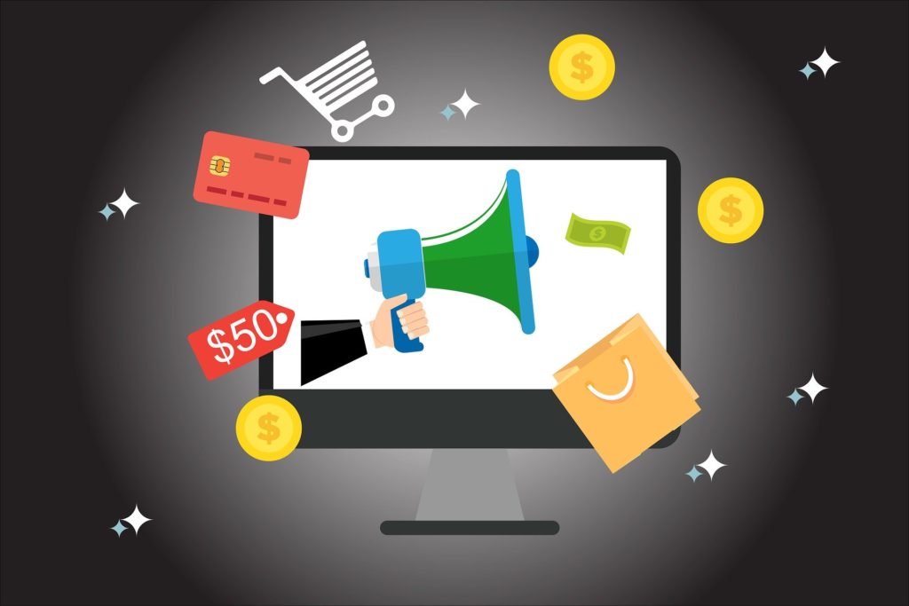
Take a good look at your payment page. The following tips will help you identify mistakes and increase your sales.
12 quick tips for optimizing your shop checkout page
- Limit yourself to one page
Try to limit the checkout process to one page. This will force you to only query the most important information, but it still works. - Show your customers their progress in the checkout process
As important as it is to limit the checkout process to one page, it is also important to inform customers how far they have come. - Do not force customers to register for an account
Around 35 percent of customers say they will leave the payment page if they are forced to register. So be sure to offer your customers a guest access option. - Create trust through security seals
Trust is an important decision factor for every customer. So-called security seals (also called SSL certificates or trust logos) strengthen trust by showing that an independent third party has checked your website. - Keep important purchase information handy at all times
It is important to always give the customer a simple snapshot of what exactly he will buy, or what he will sign up for and how much it will cost. - Create a consistent branding
It is important that your payment page matches the overall branding of the website. If elements such as layout, font, colors or user experience differ from page to page, this can reduce customer confidence in your site. - Fill in all the information you already have
You may already have some of the information your customer needs to provide during the checkout process. Use this information sensibly and fill out the form fields in the checkout process in advance. - Remove distractions
In addition to consistent branding, you should also remove any distractions on your payment page that may lead your customers away from the checkout process. Reduce highly distracting elements or even remove headers and footers altogether. - Pay attention to clear fields and CTAs
Clarity is the key when it comes to payment pages – don’t give your customers any reason to wonder what to do. - Don’t be too greedy for information
Collect only the information you need to process an order. Keep all other fields optional. The fewer fields you see, the clearer your payment page will be. - Let your customers talk to a real person
If your customer has problems, it is important to give him the option to talk to a real person. Contact options such as email and phone can be useful – there is also special software that allows you to create live chats directly on the site. - Offer alternative payment options
Not everyone has a credit card or wants to use it. So make sure you also offer alternative payment methods that suit your customers – such as direct debit or PayPal.